KAMEN
UX UI Design • Branding
Designing Kamen’s intuitive UX/UI for seamless exploration on foot
UX UI Design
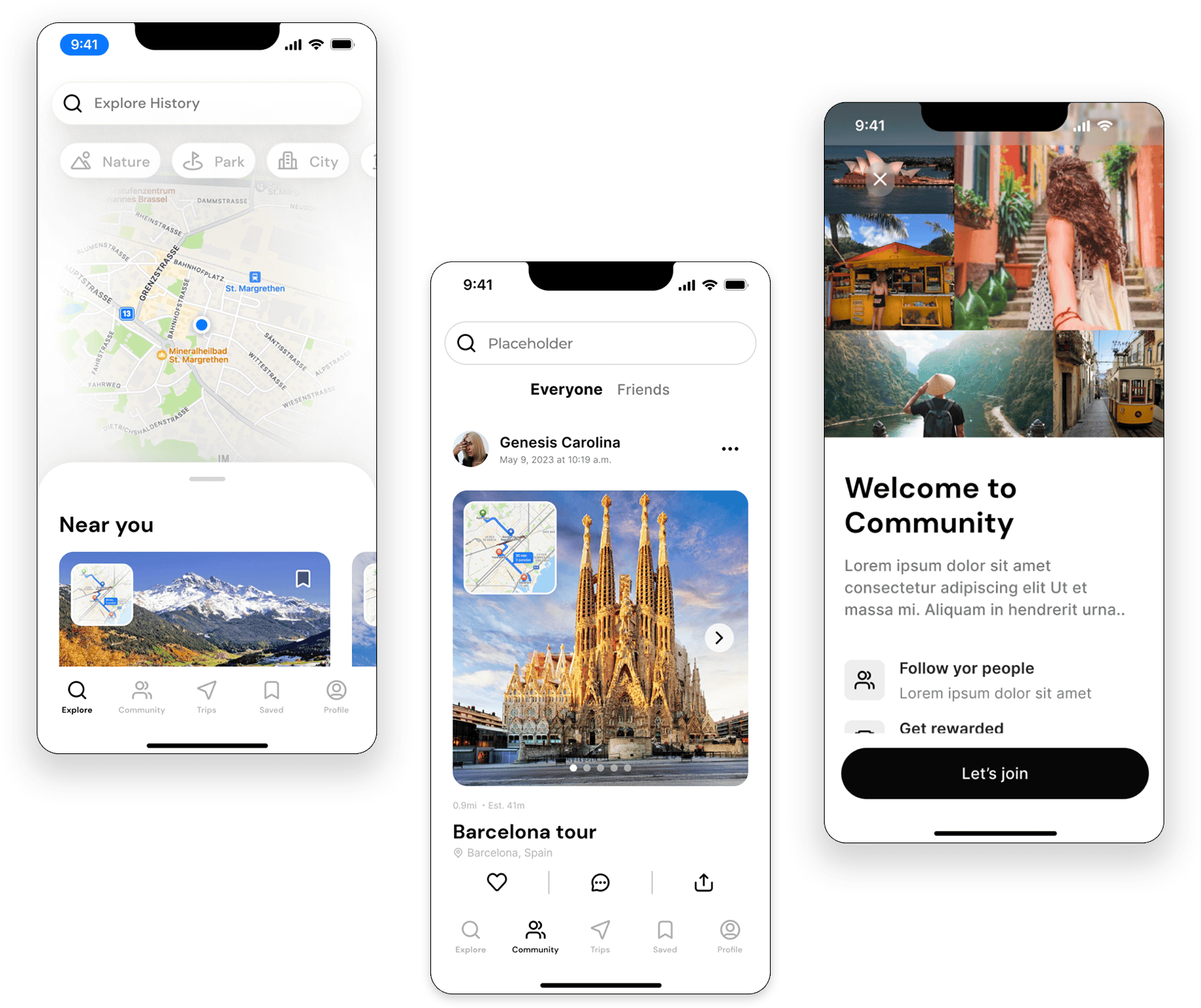
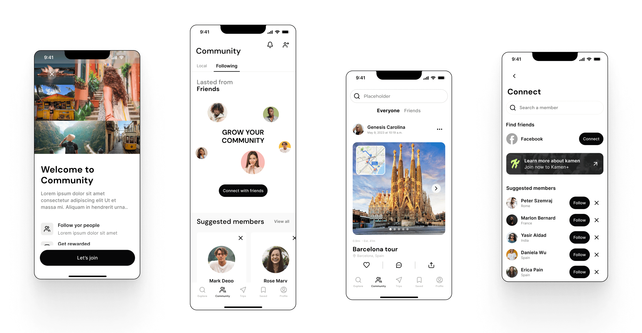
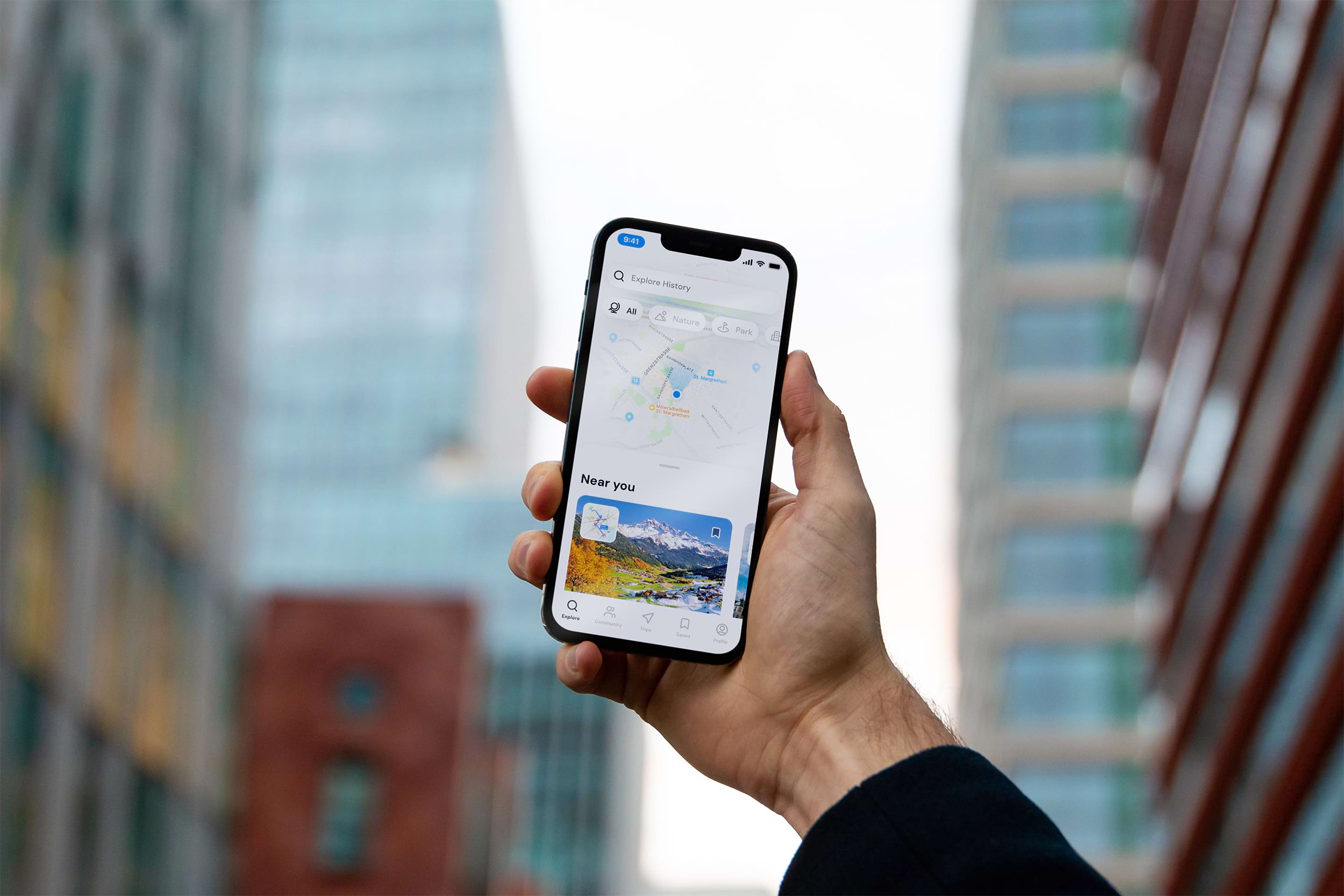
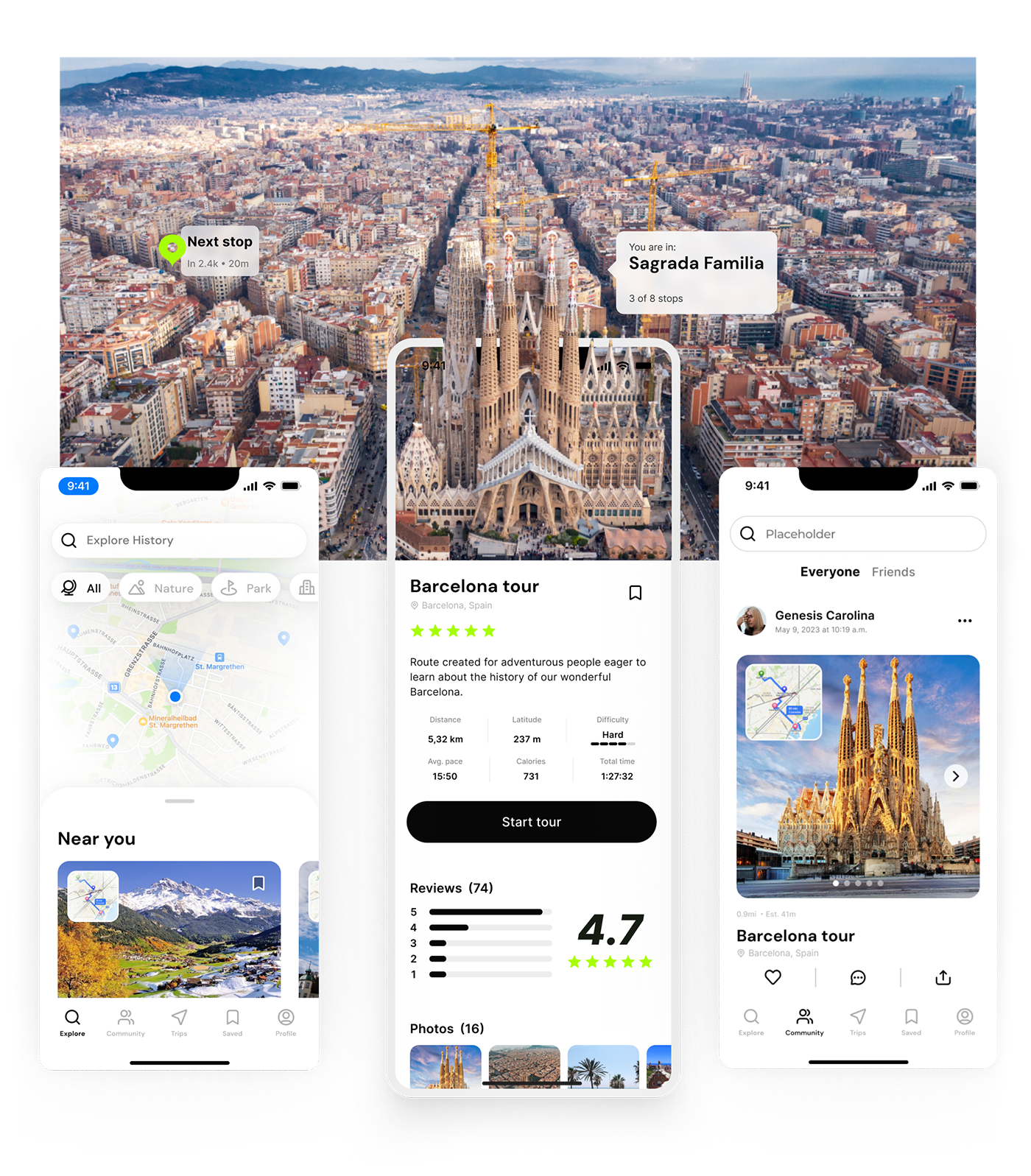
The UX UI design for Kamen was centered around simplicity, intuitiveness, and visual appeal. From streamlined navigation to intuitive mapping features, every element was meticulously crafted to enhance the user journey and encourage exploration.
App Features
For Kamen, our branding journey was a harmonious blend of simplicity, sophistication, and adventure. Inspired by the app’s mission to promote walking as a means of exploration and well-being, we crafted a visual identity that embodied these values with clean lines, bold typography, and a vibrant palette of bright green hues. The logo, with its fluid curves and confident lettering, evoked the spirit of adventure, while the bright green colors reflected the energy and vitality of the outdoors.
Design System
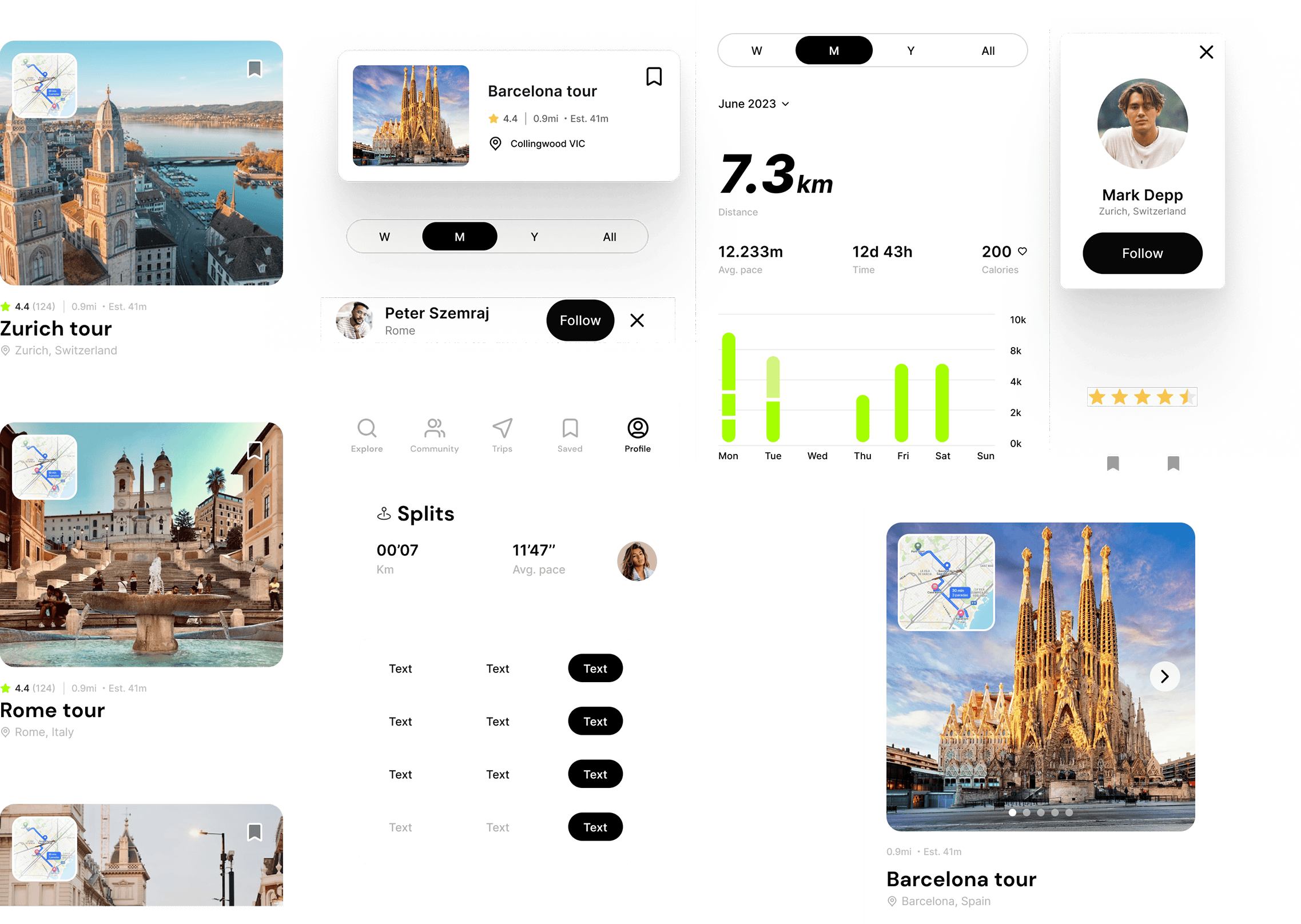
A robust design system was developed to ensure consistency and scalability across the Kamen app. By establishing standardized design elements, components, and patterns, we laid the foundation for a cohesive and adaptable user experience.


Branding
For Kamen, our branding journey was a harmonious blend of simplicity, sophistication, and adventure. Inspired by the app’s mission to promote walking as a means of exploration and well-being, we crafted a visual identity that embodied these values with clean lines, bold typography, and a vibrant palette of bright green hues. The logo, with its fluid curves and confident lettering, evoked the spirit of adventure, while the bright green colors reflected the energy and vitality of the outdoors.
Logos
Color Palette
01
CMYK |
35|0|100|0 |
RGB |
166|255|0 |
HEX |
#A6FF00 |
02
CMYK |
11|5|0|85 |
RGB |
34|36|38 |
HEX |
#222426 |
03
CMYK |
2|1|0|52 |
RGB |
121|122|123 |
HEX |
#797A7B |
04
CMYK |
1|1|0|29 |
RGB |
178|179|180 |
HEX |
#B2B3B4 |
Typography
DM Sans Bold
DM Sans Medium
DM Sans Regular
Inter Medium
Color Palette
CMYK |
12|12|0|97 |
RGB |
7|7|8 |
HEX |
#070708 |
CMYK |
35|0|100|0 |
RGB |
166|255|0 |
HEX |
#A6FF00 |
CMYK |
11|5|0|85 |
RGB |
34|36|38 |
HEX |
#222426 |
CMYK |
2|1|0|52 |
RGB |
121|122|123 |
HEX |
#797A7B |
Typography
Project Details
CONTEXT
For Kamen, our branding journey was a harmonious blend of simplicity, sophistication, and adventure. Inspired by the app’s mission to promote walking as a means of exploration and well-being, we crafted a visual identity that embodied these values with clean lines, bold typography, and a vibrant palette of bright green hues. The logo, with its fluid curves and confident lettering, evoked the spirit of adventure, while the bright green colors reflected the energy and vitality of the outdoors.
APPROACH
Our approach to Kamen was guided by a commitment to user-centric design and innovation. By leveraging extensive testing, user interviews, and prototypes, we embarked on a journey to create an intuitive and engaging user experience that seamlessly integrated health tracking and community engagement features.
CLIENT
Route planning app designed for travelers seeking to explore new destinations on foot, prioritizing health and adventure.

